
Untuk membuat efek shadow pada HTML kita dapat menggunakan CSS, yaitu dengan cara manambahkan syntax berikut ke CSS anda:
filter:progid:DXImageTransform.Microsoft.Shadow(Color=’#444444′, Direction=’120′);
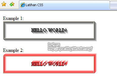
Syntax diatas akan menghasilkan efek shadow dengan warna abu-abu, seperti gambar dibawah ini:
 Untuk mengubah warna shadow/bayangannya, anda cukup mengganti warna pada atribut COLOR. Sedangkan untuk mengubah arah bayangan maka ganti angka pada atribut Direction dengan nilai dari 0 ~ 360.
Contoh lain dan hasilnya:
Code:
<html xmlns=”http://www.w3.org/1999/xhtml”>
<head>
<meta http-equiv=”Content-Type” content=”text/html; charset=iso-8859-1″ />
<style type=”text/css”>
<!–
.ShadowGrey{
filter:progid:DXImageTransform.Microsoft.Shadow(Color=’#444444′, Direction=’120′);
}
.ShadowRed{
filter:progid:DXImageTransform.Microsoft.Shadow(Color=’#FF0000′, Direction=’30’);
}
–>
</style>
<title>Latihan CSS</title>
</head>
<body>
Example 1:
<table width=”300″ border=”1″ cellspacing=”1″ cellpadding=”1″ class=”ShadowGrey”>
<tr align=”center”>
<td height=”50″>HELLO WORLD!</td>
</tr>
</table>
<p>
Example 2:
<table width=”300″ border=”1″ cellspacing=”1″ cellpadding=”1″ class=”ShadowRed”>
<tr align=”center”>
<td height=”50″>HELLO WORLD!</td>
</tr>
</table>
</body>
—
Result:
—
Baca juga: CSS: Membuat gradasi warna


thank’s banget tipsnya sobat